Update: 10 logos have been pre-selected by the selection committee, and now the logos are up for a PUBLIC VOTE. Cast your vote!
Update: Submissions are now CLOSED. Thank you to all who made logos, they are awesome!
Update: We’ve been getting so many logos (over 45 logos 60 logos 100 logos submitted!) so the deadline is now extended till march 3rd.
Update: Over 31 submissions! The page below has been updated with the logo submissions to the forum. We will keep accepting logos for another week (until Feb 24th) then will put logos up for selection. THANKS!
Update: For discussion on the logos, please do NOT write in the comments below, but rather go to the forum
With the Open Hardware Definition, we would like to release a logo for Open Hardware to be attached to the definition, and used to brand Open Hardware. Please propose your logos, or comment on the below ones at the Definition Forum under the thread LOGO.
Note: This is a community driven definition and branding effort. Correct usage of the Definition will not be inspected or enforced. So please use your judgment
Criteria: The logo for the Open Hardware Definition must:
- Be easy to print/see on a PCB
- Be easy to print/see on a Schematic document
- Signify Open-ness
OSHW Logo
1- Open Lock
Submitted by: Open Hardware Summit
Designer: Mateo Zlatar
Date: July, 2010
2- O-H
Submitted by: Sparkfun
Designer: David Stadler
Date: December 9th, 2010
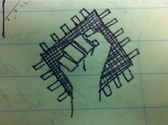
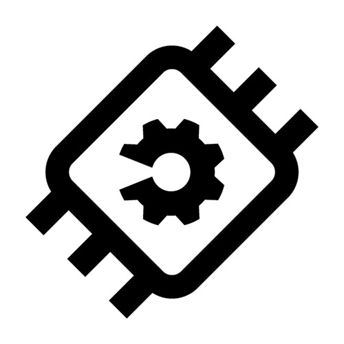
3- Iconographic Microchip
Designer: Nic
Date: January 24th, 2011
4- Open IC
Designer: Chema Alcérreca
Date: February 10th, 2011
5- Self-cannibalizing wrench
Designer: Cameron Leslie (cbleslie)
Date: Feb 10th, 2011
Description: A “self-cannibalizing” wrench depicting self repair, recycling, revisioning, refactoring, infinity and hardware. This idea is not new and has been around for centuries and is depicted elsewhere in history as the self eating snake. It is obviously in an “O” shape to depict “Openness” and is recognized as a symbol for “yes!” in many Asian cultures. Green was used, as this is an international color for “Go”, so perhaps to give an impression of a green indicator on a stop light.
The second element is comprised of a “happy face” and immediately shows the viewer that “it’s okay” or “it’s good” to take part in this activity. Perhaps evening putting the mind at ease that what your doing (or about to do) is right and is within your rights.
6- Open Hardware Development
Designer: Ted Ullrich
Date: Feb 10th, 2011
Description: Logo highlights the open process of give and take between people developing hardware.
7- OHW/OHM
Designer: Ken Stone
Date: Feb 11th, 2011
Description: Here’s my submission for an Open Hardware logo. It was done using GIMP + the ‘Open Symbol’ font under ubuntu.
If it isn’t obvious what’s going on here, imagine looking at it through a mirror placed above or below it.
I know, there’s no cute monkeys or anything, but I think it’s distinctive, simple, memorable, and (of course) geeky
8- Revolution Description Language
Designer: Roberto Guerra
Date: 1/11/11
9- Ogear
Designer: Andrew Somerville
Date: Feb 11, 2011
10- Free_Spinning
Designer: Brandon L.
Date: 2/11/2011
Description: a broken lock with a gear instead of just an open one.
11-stylized omega
Designer: VitaminP
Date: Feb 11, 2011
Description: I think simple is best. This stylized omega contrives the form of a keyhole and gives the sense of a tunnel opening into sunlight. Needs some refinement of angles and thicknesses, but it works well at any size. It also works well as a line interruption: which provides a nice option for document headers and device integration.
12- Morphed Bird
Designer: Benjamin Chalovich
Date: February 11, 2011
Description: It is a bird morphed out of a gear with circuit board styled lines.
The bird represents freedom – yet it is made out of mechanical parts. It is the embodiment of hardware that is free.
13- Solderable Logo
Designer: Device666
Date: Feb 11th, 2011
Description: The idea of this logo is that it is also possible to solder the logo. Which makes it easy for everyone in the community too make use of the tools easiest available to get the logo on the hardware itself, which I think is inline with the idea of open source.
14- OpnKy
Designer: ercwtsn
Date: Feb 11, 2011
15- winged wrench
Designer: PauloS
Date: February 11th, 2011
16- Golden Orb
Submitted by: Golden Orb
Author: Macklin Chaffee
Date: February 11th, 2011
Description: I think it would be a mistake to not allude to Open Source branding. People know open source. I don’t remember ever reading anything about Open Hardware (though I’m a software guy) until I saw the Open Source Hardware Definition Release on Slashdot (congrats). colors are hue-shifted duplicates of Open Source. I see the font being changed to something more standard. Someone help me out here.
17- Spanner/Wrench
Designer: samfentress
Date: Feb 11, 2011
Description: Why use obscure symbols when a word will offer instant clarity? It’s short and to the point. The spanner/wrench both signifies “hardware” and the idea that “anyone can open it.”
(My lines are a little screwy because I did this quickly. It could easily be smoothed about and made into an svg. The font is Impact. An open-source font could be used.)
18- Puzzle


Designer: Hjalti Hjálmarsson
Date: Feb 12th, 2011
Description: it’s simple, easily readable as hardware, a part of a great whole, connectability and is also designed to look like a human figure …which personally I think is the point with the open source concept, connecting creative people
19- Seco
Designer: Seiku
Date: Feb 12th, 2011
Description: This should be readable to more than a billion Chinese, 100 million Japanese, and maybe about a million European and American. Actually, it is a picture, the same as below.
Originally, I was about to propose this:
20- Open Lock v2
Designer: IHeartEngineering
Date: Feb 12th, 2011
Description: I like the ‘Open Lock’ but I would like to see it opened up a little more to make it easier to engrave into 3D printed objects
21- Mark
Designer: pflodo
Date: Feb 12th, 2011
Description: I think it should be very basic, so easy to put anywhere.
I think of it more like a mark than a logo, like the copyright, trademark, creative commons
Then for graphic environments
A small easy to put anywhere logo
And a larger one for when you have more space
22- OH Component
Submitted by: Roy Mohan Shearer
Designer: Roy Mohan Shearer
Date: February 12th, 2011
23- Open Lock v3
Submitted by: Roy Mohan Shearer
Designer: Roy Mohan Shearer
Date: February 12th, 2011
24- Few ideas
Designer: ercwtsn
Date: Feb 12th, 2011
25- Angry Drill
Designer: Randy Gill
Date: Feb 12th, 2011
26- Roy Shearer v3
Submitted by: Roy Mohan Shearer
Designer: Roy Mohan Shearer
Date: February 12th, 2011
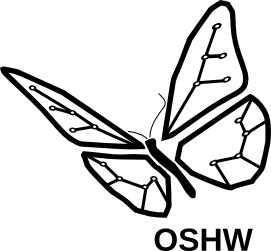
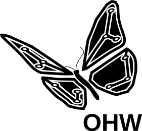
27- Butterfly
Designer: wyojustin
Date: January 24th, 2011
Description: The butterfly represents freedom. The wings are PCBs. I’ve simplified it by removing some nodes and thickening the traces. The font is Liberation Sans Bold. It was designed using Inkscape on Ubuntu.
28- copyleft chip
Designer: Dr Snaut
Date: Feb 15th, 2011
Description: Etymologically it’s refers to the well known “copyleft” concept and shows well recognisable conventional “chip” sign.
Reversing layout (shows as it could be printed on PCB).
I use the font Bebas http://www.fontex.org/download/Bebas-neue.otf sanserif, which is rhythm with logo outline and masses, and could be useful in relevant compositions. Please note that font block is not obligatory detail, logotype able to be used laconically without any text block.
29- Open Power
Submitted by: Greg Quisenberry
Designer: Greg Quisenberry
Date: February 15th, 2011
30- Golden Orb v2
Designer: EverydayInventors
Date: Feb 15th, 2011
31- OHArrows
Designer: Phil Torrone
Date: Feb 15th, 2011
Description: it’s an O and H and the two arrows are formed to show “openness and sharing”…
32- Mashup
Designer: EverydayInventors
Date: Feb 15th, 2011
Description: Here’s a quick-and-dirty mash-up of dr.snaut’s chip logo and Macklin Chaffee’s keyhole-gear logo. I’ve edited the gear slightly to be more “C” like, and to have more defined teeth
33- Golden Orb v3
Designer: jedibfa
Date: Feb 17th, 2011
Description: The above poster’s proposed logo is still one of my favorites. In his post he asked if anyone had any ideas for improving the font. It turns out Mach 30’s secretary is also our graphic artist, and she is suggesting avant garde condensed.
34-OSHW Connections

Designer: dseisner
Date: Feb 20th, 2011
Description:The letters OSHW have become pretty iconic of open source hardware. Riffing a bit off of Chema’s design, thought I’d toss this into the mix.
35- Open Circuit v1


Designer: LiR
Date: Feb 21st, 2011
Description: We’ve chosen a circuit as representation of Hardware, despite the wide concept included in the definition, for two main reasons:
- The word Hardware is normally used to refer to computers and electronic devices.
- A implicit tribute to the origin of the OSWH movement.
As for the open-ness meaning we would like to give a clear idea at a first glance using a simple open lockpad for the first logo and the well known open source symbol for the other.
36- Few concepts


Designer: johngineer
Date: Feb 21st, 2011
Description: My idea with these was to make something that could be printed quite small (as in a silkscreen on a PCB). I also wanted something that wasn’t explicitly tied to electronics. I realize most OSHW (at the moment) is electronics, but I think the logo should be more universal. I used an isometric projection to evoke the idea of a physical object, as well as the engineering aspect — many physical blueprints use this type of view (think exploded assembly diagrams). The first one is a 3-D “H” within an “O”, inside a sort of dimensionally ambiguous hexagon. The second one is an “O” on top of, and orthogonal to, an “H”. I like this one because it is very simple and will render well when printed on a small scale. The third one is an alphabet block with the letters “O”, “S” and “H” — to evoke the idea of using open-source hardware as a building block for a larger project, just as we use individual letters to make words, and then paragraphs, and so on. The notion of an alphabet block also conjures up the fearless creativity of childhood. The fourth one is the one I like the most. It’s an open box, with a “0” on one side and a “1” on the other. The box symbolizes a physical object, the 0 & 1 symbolize information, and the open lid symbolizes openness.
37- Debreuil design v1

Designer: debreuil
Date: Feb 21st, 2011
38- Debreuil design v2

Designer: debreuil
Date: Feb 21st, 2011
39- Open lock v4
Designer: Allan Andrade
Date: Feb 21st, 2011
Description: As you can see the O of open is the circle, the open lock reading like the S in the source and the H of hardware.
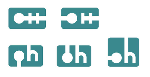
40- OH capacitor
Designer: Hock Ng
Date: Feb 21st, 2011
Description: Using the capacitor and resistor symbol to form the ‘HW’ inside the ‘O’. The ‘O’ has broken links to symbolize openness.
41- Hex screw head
Designer: Greg Quisenberry
Date: Feb 21st, 2011
Description: A backwards “C” can now be seen reminding us of the copyleft logo. It does not illustrate any kind of hardware like a microchip or gear so it can be universally applied to many different things now and in the future. An interior arrow can denote the flowing of ideas in and out of the source like in the first two images or to give the logo more of a hardware theme I added a hexagon giving an illusion we are looking down at a Hex screw but also looking like a target for your ideas to enter while keeping the arrow for ideas to flow out. Still has an aesthetically pleasing “O” for Open. Does not contain the broken lock which some have pointed out might be a reminder of security problems. Should be easily printable with lettering or alone, in different colors, large and small, in 3D, etched or stenciled and still remain highly recognizable.
42- Open Hardware Bolt Logo
Designer: Jerome Kelty
Date: Feb 21st, 2011
Description: The first thing that comes to mind when someone says “hardware” is a bolt- that’s why I used the hexagon bolt outer shape. A bolt is also something that helps hold everything together and to me that’s the idea behind Open Hardware- everyone working together, developing a standard that holds everyone together. The “O” and “H” are pretty obvious and I just tried to keep it really super simple so it’s immediately recognizable and is readable no matter the size- whether it’s printed, laser etched, stamped, anodized, etc. it should make no difference. I also like the “O” encircling the “H” as many types of hardware could fall within the Open standard. The image isn’t perfect and it needs a bit cleaning up- mostly in the thickness of the “O” and “H” but it’s a start.
43- Make with “legarage of Saint-Etienne”
Designer: Léo, Damed, Clem and Liol
Date: Feb 22nd, 2011
Description: This summit represent an chip (hardware) with the open source inversed key inside. We add an customized arm and(or) eyes for the community aspect, essential in the open source philosophies. This second aspect is free to modification, if an developer just want remove arm and add an tongue or an hat, he can, and we’ll encourage the community to play with. As long the chip and inversed key are here for symbolize Open Hardware, community is an permanent moving aspect. And for finish, this green we chose, is a wink to the T-Mobile copyrighted magenta (http://www.freemagenta.nl) witch we only inversed.
44- Open Hardware Logo “Gear’n Chip”
Designer: Fred PRATE
Date: Feb 24th, 2011
Description: I’ve tried to keep it as simple as possible
45- Open Hardware Infinity
Designer: Jayden Tutty
Date: Feb 25th, 2011
Description: Infinity: no boundaries, no obstacles, no restriction. Signifies the openness and freedom of open source.
46- Open Arms
Designer: Peter
Date: Feb 25th, 2011
Description: This image open arms, for any hardware, uses simple lines and circles available to a cad program so can be easy to add to your board files schematics etc.
47- Switch to Open Hardware

Designer: Colin Faulkingham
Date: Feb 25th, 2011
48- Open Chip Book
Designer:marc foret(ptitbul)
Date: Feb 25th, 2011
Description: The idea of an open book but applied for a chip
49- Soldering Iron

Designer: JP
Date: Feb 25th, 2011
Description: For me soldering iron is the symbol of freedom to create, to modify and to take apart.
50- OSHW- A new Day

Designer: David Sanderson
Date: Feb 26th, 2011
51 – Candy Capacitor
Designer: Tachikoma
Date: Feb 26th, 2011
52- OSHW Bot

Designer: David Siren Eisner
Date: Feb 26th, 2011
Description: I’ve always been of the opinion that things get better when you add 8-bit robots.
53- Osmosis
Designer: Vincent C
Date: Feb 26th, 2011
Description: Osmosis (http://en.wikipedia.org/wiki/Osmosis)
54 – Simple
Designer: Michael Rucci
Date: Feb 26th, 2011
55- Open Gear v1
Designer: bent-tronics
Date: Feb 26th, 2011
Description: open lock design from LiR (entry #35)
56- open arrow
Designer: Nick Vida
Date: Feb 26th, 2011
Description: two fingers touch the same chip and create 2 arrows in this logo entitled “Open Arrow” which is intentionally simple and easy to view at low res. It makes a good favicon, and it doesn’t reference an icon with a meaning already like a lock or something. The arrows signify movement and ascension and is discrete but present. two hands are sharing. Nice iconic and usable weblogo that is elegant at a lot of resolutions. If it is chosen, I would like to clean it up some more and perfect the shapes.
57- Simple Components
Designer: Lucas S.
Date: Feb 26th, 2011
Description: I like these logos because they are simple and also show the nature of products being formed from separate hardware components.
58- OHS person
Designer: Claudio Miklos
Date: Feb 26th, 2011
59- Into the sea (of OSHW)
Designer: Kiate
Date: Feb 26th, 2011
Description: Enough of selFISHness! Put it into the sea (of OSHW), so that the others may have a chance to fish the ‘FISH’. PS.: Inverted Omega sign (fish bowl) was inspired by slowgenuis’s design
60- Open gates, get out sistor
Designer: Robotop
Date: Feb 26th, 2011
Description: here is my proposal. I did it directly on the touch screen of my Fujitsu stilistic. Obviously, there is space for improvements !!! Just to give an idea… and to partecipate to this borning project.
61 – logo ideas 1 through 5
Designer: Scott Griepentrog
Date: Feb 26th, 2011
Description: Playing with the letters, trying to keep design simple
62- openthebox
Designer: chromoxdor
Date: Feb 26th, 2011
Description: You can open the box and know what´s inside
63- Open Nut

Designer: DinoSegovis
Date: Feb 26th, 2011
Description: Nut with arrow showing direction to remove nut or open. Nut is a good universal symbol for hardware.
64- Negative Space
Designer: Phillip Burgess
Date: Feb 26th, 2011
65 – Great Minds
Designer: Phillip Burgess
Date: Feb 26th, 2011
66- Bit-OH-UnLock
Designer: Sanzibar
Date: Feb 26th, 2011
67- Open Chip.
Designer: Luis Castaño.
Date: Feb 27th, 2011
Description: The logo is an schematic design of a chip (hardware) who “opens” to an schematic landscape. The second logo represents a chip (hardware) into an open cercle formed by 4 arrows who “turns”. This open cercle remember an O but means this idea of “collaboration”, of “circulation” between developpers. This proposition (my third proposition) is derived from my second proposition and looking for reduction and minimalism. The fourth is a variation about my third proposition but inspired by the idea of Solderable Logo (device 666). I think this graphic (5 dots x 5 dots) is, perhaps, possible to solder. The fifth is inspired by the idea of Open Nut (dinosegovis). The idea it’s also an open nut (hardware but not only electronic hardware) bur there is a diference in the graphic. This nut is differently “open” and the design remember the logo of Open Source.
68 – Circuit Board with Holes
Designer: Jac Goudsmit
Date: Feb 27th, 2011
Description:
Here’s my version of an OSHW logo, partially inspired by Device666’s idea of using soldering patterns. I used MS Paint to draw it but it should be easy to reproduce in other programs including PCB design software. Thoughts: I used simple shapes (squares) for the letters, which will be easy to recognize from a distance, even if reduced in size. When I think “hardware”, I think “circuit board”, so for the details I used shapes that resemble PCB traces. When I think “open”, I think “holes”, so I used vias/holes as part of the design.
In order to use the logo in the same location on both sides of the same PCB, the holes have to be in a symmetrical pattern: the holes in the “O” match the holes in the “W”.
90-degree angles are a problem with some forms of PCB production (the chemicals “eat away” at them), so I used 45-degree angles only (except in the text).
I wanted to make it easy to reproduce the logo in a PCB design program, so I made sure that the horizontal and vertical distances between all holes are a multiple of 16 pixels (at this magnification level). This should help to align the drill holes on a grid.
I wanted to make the version number of the specification part of the logo so in the future it will be possible to distinguish between older and newer hardware.
I put the URL of the website in the logo to give a hint about what it means. The font was hand-pixeled.
As a bonus, the logo can also be easily reproduced as a cutout in a ground plane on a PCB. Obviously the version number and the URL aren’t going to legible if the logo is reduced to e.g. 0.1″ per 16 pixels, but it’s easy to make a simplified version without the text if desired. On the other hand, the logo can also be expanded to add more text. I also realize that the letter “O” may be a little difficult to recognize as such. I considered drawing traces between the three holes in the “O” but that introduced a confusing “T” or “U” or triangle shape that I didn’t like when I tried it. An alternative is to turn the “O” upside down and then draw the traces. That, however, would mean that on the back side of the PCB, the entire logo would need to be turned upside-down.
69- Open-core


Designer: Jack Qiao
Date: Feb 27th, 2011
Description: I wanted to do something a little bit different from the lock imagery, and also stay away from letter forms to accommodate non-English users.
I remembered those cutaways of stars from astronomy books, and I thought it’s a great metaphor for openness that also has a solid, tangible feel.
70- Open door OSHW
Designer: Miros2424
Date: Feb 27th, 2011
Description: the open door signifies openness
71- The Open Door v1
Designer: Eduardo Merchán Álvarez
Date: Feb 27th, 2011
Description: This logo is the graphic translation of the two key concepts Open Hardware means. The idea of the open door is an international concept which means openness, welcome, freedom and invitation to pass throught.
The soldering legs around the doorframe introduces the idea of hardware and electronics. The combination of this two concepts increases the main idea of the Open Hardware, inviting people and brands to asimilate this proyect and contribute in it. The logo has been made with the criteria of very small size reproduction in one single color, without lost of details or restrict the supports in which it can be printed.
72- opentheroundbox
Designer: chromoxdor
Date: Feb 27th, 2011
Description: You can open the box and know what´s inside. This time i have chosen an opened round box because it reminds me of a flower (and maybe some video games ) because it is something that grows.
73- openminimal
Designer: chromoxdor
Date: Feb 27th, 2011
Description: A very simple logo. The circle in the gear is the O that represents open and the gear itself stands for hardware.
74- Universal open source container for license or icon
Designer: logan
Date: Feb 27th, 2011
Description: It would be useful to display licenses directly on open source hardware, so this logo includes space for the names or logos of applicable licenses (e.g., copyleft symbol or “GPLv3”). The space could also hold icons specific to the type of hardware. For example, people who develop open source electronics could rally behind the logo with a microchip icon inserted into the space (e.g., to wear on shirts), while people who design 3d-printed objects could have their own symbol inside. All would be unified by this logo with its very clear text understandable by the general public. This provides flexibility without losing brand recognition.
75- Open Source Hardware Logo 1 & 2 (GearChipBook)
Designer: Joe
Date: Feb 28th, 2011
Description: Logo 1 is a minimalistic logo that would be easy to silkscreen on a PCB or to create vinyl stickers to slap on other hardware/projects that adhere to the OSHW definition/credo. The gear and the IC pay homage to the hardware aspect of the movement which isn’t only for electronics enthusiasts but makers and thinkers of all types. The IC is also an open book not only signifying the concept of open source but also the role that this movement plays in education of current and future generations of innovators. Finally, the gear encompasses the IC/Book which gives a nice subliminal OH (for Open Hardware) for those English speakers/readers among us. Logo 2 is a very similar concept to the first logo but leaves out the open book. This is simply because the blank space on the IC gives options to different designers for modification. This blank space could also be used for a particular area of interest in the OSHW movement or used for various applicable licensing symbols. Again the gear and the IC signify the hardware aspects of the movement. The subliminal OH is there as well (for Open Hardware). Finally, in an effort to give an idea of how these logos would work I’ve attached this last file as well. The different logos as shown above would work very well as singular ‘stamp’ type logos which would be very iconic. However the gear aspect allows several logos to be ‘linked’ together as the gears mesh. As stated above, letters could easily fit in the logo to create various words/acronyms as shown. Please keep in mind that I have no delusions of Sparkfun or Adafruit in using this logo, they just are here to serve the purpose of how different branding concepts could work. But for us less iconic/prolific makers we could simply use another blank gear to input design information as shown.
76 – OSHW I/O, Mk. I

Designer: Joshua Dotson
Date: Feb 28th, 2011
Description: The logo is meant to instill creativity, wonder and excitement in the viewer. It makes a nearly animated statement about what goes into the design and implementation of any hardware it appears upon.
77- OSH Key Lock

Designer: Samuel Marcos
Date: Feb 28th, 2011
78- opengear v2
Designer: chromoxdor
Date: Feb 28th, 2011
Description: This is a open gear with different color and text options.
79- Open Door v2
Designer: Bob Coggeshall
Date: Feb 28th, 2011
80- “Open cage”


Designer: Adán Sánchez de Pedro Crespo
Date: Feb 28th, 2011
Description: The logo features the word “oshw” surrounded by a frame which is open at its upper-right corner, where two birds can be seen flying away like they were escaping from an open cage. Everything has been schematized to look like electrical circuit tracks and be easier and cheaper to print on PCBs. Of course it has been designed using only FLOSS software.
81- “OH-Screw”
Designer: Ralph Kaeppeli
Date: Feb 28th, 2011
Description: The letters O and H standing for Open Hardware, combined and open at the top resemble a stylized screw. Very simple and easy to recognize.
82- Unified logo


Designer: Cr3at0r
Date: March 1st 2011
Description: I saw a few designs on the boards and liked them. i decided to throw a few of them together to make one unified logo. I applaud the creativeness and hard work of everyone that has submitted. This is my collaboration of work. I call it unified or unity. I’m sorry if I offend anyone and want to say these would not have been done with out all your hard work. I only take credit for the end result.
83- a mash-up of the open lock, a hex nut, a 3D cube and a PCB trace
Designer: Kyle Lawson
Date: March 1st 2011
Description: My goal was to create an icon that could be stenciled both as a negative shape, or a positive. I loved the original open lock logo, and wanted to play with it. The final design is a mash-up of the open lock, a hex nut, a 3D cube (because we’re talking about real objects), a PCB trace, and a take on the copy-left logo. I’ll make a second post with an .EPS file if anyone wants to play with it some more. I chose Helvetica Neue, because it was the first font choice on the Open Hardware Summits site. I’m very open to it changing.
84- Open-Key
Designer: Jack Qiao
Date: March 1st 2011
Description: this logo is a combination of 3 graphics drawn with a circuit diagram style
– a key
– the “start” symbol of a computer (0/1), sideways
– backwards c for “copyleft”
85- Open-Circuit v2
Designer: Jack Qiao
Date: March 1st 2011
Description: this logo expresses “openness” with two out-stretched hands. It also includes a branching metaphor that reflects the process of open-source innovation.
86- Open Source Hardware Branding
Designer: James Holmes
Date: March 1st 2011
87- Open-Circuit v2
Designer: joz
Date: March 1st 2011
Description: This logo is just a simplified representation of an open circuit
88- Some Ideas
Designer: pathfinder X
Date: March 1st 2011
89- By Martin

Designer: Martin Bachmayr
Date: March 1st 2011
90- By Martin v2


Designer: Martin Bachmayr
Date: March 1st 2011
91- opengearnchip
Designer: chromoxdor
Date: March 1st 2011
Description: i added a chip to the gear to include the electrical part of hardware.
92- Open lock v5

Designer: Adán Sánchez de Pedro Crespo
Date: March 1st 2011
Description: The logo features the word “oshw” conforming a subliminal open lock. Everything has been schematized to look like electrical circuit tracks and be easier and cheaper to print on PCBs. Of course it has been designed using only FLOSS software.
93- OSHW key
Designer: João Paulo Cerquinho Cajueiro
Date: March 1st 2011
Description: A key formed by the letters O and H. I think that a key gives a better idea of open than an lock.
94- Theta
Designer: Nashblackcat
Date: March 1st 2011
Description: Theta is the eighth letter of the Greek alphabet. In the system of Greek numerals it has a value of 9. The number 9 is a lucky number in China and homophone of the word for “longlasting”. Plus the added look to an O/H helps too.
95- Geared
Designer: Fred PRATE
Date: March 1st 2011
Description: A simple open circuit gear-shaped.
96- OHctopus
Designer: Fred PRATE
Date: March 1st 2011
Description: I’ve tried to represent the community. So yeah, the little eyes all over the gear are the amazing people who build crazy things and share them with the world (yes the world is a big gear). I think the octopus could be a cool metaphor for the very action of tinkering. Never enough hands. You start something, then realize that you need some more information on a totally unknown discipline.
97- Simple and clear
Designer: Brett Williams
Date: March 1st 2011
Description: This design is going for simplicity and clarity. The middle aspect is the source symbol. Wording is used to keep the design simplistic, easily reproducible and recognizable. Blue color used because many hardware companies have blue as a distinguishing color.
98- Under the hood
Designer: John Anderson
Date: March 2nd 2011
99- Open Bin
Designer: Roy Cortes
Date: March 2nd 2011
100- Geared
Designer: Ben Edwards
Date: March 2nd 2011
Description: Both are nice designs but still lacking something, so I decided to put them together and see what it would be like. The result with a bit of tweaking is here, with credit for the initial design ideas to the people named above (Fred Prate and DinoFab). As I placed the opening to the right, it isn’t quite as dynamic as the others with their openings on a diagonal, but the logo is easily identified, whatever angle of rotation it may be placed in.
101- “The geared arrow”
Designer: Fred PRATE
Date: March 2nd 2011
Description: I thought about putting the white holes into the electronic track but I was not satisfied with the result. With “geared”, I’ve tried to avoid tiny details to make it easy to print on pcb. It’s less realistic, I agree, but more “iconic”, simpler.
But, since it’s a community effort, I’ve tried to integrate your suggestions, Theben and Bluke, and here is the result: two logos, one with OH for Open Hardware and one without it.
102- Open Hardware Power Button

Designer: Eric Froese
Date: March 2nd 2011
103- circuit diagram drawings
Designer: Nicci Shaw
Date: March 3rd 2011
Description: Inspired by circuit diagram drawings.
104- circuit diagram drawings v2
Designer: Nicci Shaw
Date: March 3rd 2011
Description: Inspired by circuit diagram drawings.
105- a simple 6pin chip with the top opened up
Designer: VuDuDaDi
Date: March 3rd 2011
106- Circuit Board
Designer: Nicole Rende
Date: March 3rd 2011
Description: I first thought about a circuit board and how it connects. I wanted to connect the O and he H so that it connected.
107- OH Glasses
Designer: Garry Qualls
Date: March 3rd 2011
Description: I think that the logo should have some moxie. You can kind of imagine that the “H” is one eye winking at you.
108- Open Hardware Bot
Designer: Mimil
Date: March 3rd 2011
109- Unlocked IC
Designer: Chris Fourie
Date: March 3rd 2011
110- Simple Open circuit
Designer: BeccaBlanc
Date: March 3rd 2011
Description: Presented in four color options, as well as flat B&W option
111- OH!

Designer: Wookie
Date: March 3rd 2011
Description: I’ve gone for something simple, starting from a mechanical element, made of bold lines/forms that could be easily printed or engraved and that tried to keep the surprise factor visible (OH, as in Oh!, what an awesome acronym). The slight turn of the bolts intends to convey movement and their placing tries to get close to the infinite symbol without being too evident.
112- Open Hardware

Designer: Christopher Benjamins
Date: March 3rd 2011
Description: This logo design is based on the Open Source Software logo. I thought that since they are related in a sense, that the logo should share the same attributes. I chose just to convert the open ring into a open square. I chose a square because it seems to have a more “hard” feeling, where the circle has a softer feel to it.
113- OH rocket
Designer: Garry Qualls
Date: March 3rd 2011
Description: Here is a rocket because I think it captures the spirit of the open hardware movement in an iconographic form. I like this because the sky is not the limit for OH, the person is being transported physically and emotionally by their open hardware, and real rockets place the Oxygen tank in front of their Hydrogen tank to improve the vehicle’s center of mass.
114- OHSH simple open logotype
Designer: Danielle Lehrman
Date: March 3rd 2011
Description: An elegant, simple logotype that conveys openness. The logotype of the acronym OSHS can stand alone, or can be coupled with the full spelled-out words below as pictured.
115- StackableHardware

Designer: John M. De Cristofaro
Date: March 3rd 2011
Description: It’s simple, and designed to be printed small (about 1/2″ tall). I added the 1.0 at the bottom to indicate the license revision. It looks good white-on-black, or black-on-white, so you can silkscreen it onto a PCB or engrave it onto plexi or even mill it/etch it into metal. I think it looks pretty good on a circuit board, and doesn’t take up a lot of room.
116- Stepper Friendly
Designer: Alex Arbit
Date: March 3rd 2011
Description: Because this logo is intended for use on any kind of open hardware, I wanted a simple logo that could be easily rendered by and programmed into even the crudest of machines. The simple, right-angles and even spacing of the logo allow for even rudimentary stepper-motors to print or engrave it. It represents openness by being open itself: it is a single, open path that abstractly creates the letters “Oh”. Because it is a simple path, it can be correctly rendered at many line thicknesses, allowing an easily recognizable logo to be presented on any surface by any method. Because it is completely open, it can be cut as a stencil without modifications.
117- Opened Open
Designer: Ben Brockert
Date: March 3rd 2011
Description:A simple textual representation of just the word “Open”. The hardware is implied by it being on hardware. Can be printed very tiny on a PCB or with ink, can be milled as a positive or a negative (in a single tool width), can be stenciled or plasma cut.
Adding gaps to the closed letters signifies the openness, while making it also stencil-able. Stencils are evocative of do-it-yourself and of modifying something that already exists.
In the 3d printed version both words are less than 1″ long .
Two typefaces are presented, each has its merits. Another option would be to round the sides of the gaps.
118- oh circuit
Designer: Álvaro
Date: March 3rd 2011
119- Open Hardware Logo
Designer: Alyssa Cooper
Date: March 3rd 2011
Description: I designed this logo to have an elliptical appearance, much like an open eye. I wanted to evoke this feeling of openness rather than closure, and thought of the human body as an interesting point of inspiration. An open eye goes with an open mind, so I felt that this was an appropriate point to mimic. I wanted the H to appear almost circular, like an iris, and to give off a feeling of dimensionality. I then used the spherical H in the words “Open Hardware” to tie the two ideas together.
120- Open Source, Open Eye

Designer: Brittany Stadler
Date: March 3rd 2011
Description:The reasoning and inspiration behind Open Source tools inspired me to create something eye-opening. I believe that Open Source tools can help designers experiment in new mediums and create things we have never before been able to.
121- Open Lock
Designer: Courtney Scott
Date: March 3rd 2011
Description: Inspired by a key turning an open lock
122- Open Arrow Logo
Designer: Katie Malone
Date: March 3rd 2011
Description: inspired by gears and open arrows.
123- Open Circuit Logo
Designer: Katie Malone
Date: March 3rd 2011
Description: O & H are inspired by a circuit board.
124- Open box logo
Designer: Anne Schlaffmann
Date: March 3rd 2011
Description: I designed this logo because I see OpenSourceHardware as an open box within anyone can give and take. The symbol might also be used alone, with out the typography, as a “label”.
125- c in a box
Designer: devbisme
Date: March 3rd 2011
Description: I think this logo is a mashup of a couple of ideas I read in this post, but I don’t see anything exactly like this. My main impetus for posting this is that I want something very simple, easy to fabricate in a single color on a PCB, and that’s legible even when it’s tiny (some of my PCBs are 2″ x 1″ and I can’t afford a logo that’s 1/2″ in size). I’m no graphic designer (obviously), but I hope whatever the winning entry is, it’s something that I can screen onto my PCBs.
126- Open Hardware Bolt Logo
Designer: dennis
Date: March 3rd 2011
Description: The bolt suggests hardware. The cross-section suggests openness.
127- OH Spiral
Designer: Garry Qualls
Date: March 3rd 2011
Description: This is a more verbose idea, explicitly listing four primary focus areas for many Open Hardware projects. When shown or printed at a small size, the text would be omitted. The outer circle is divided into four pieces by the spiral breaks to make it an open shape.
128- OHS connected
Designer: ohraley
Date: March 3rd 2011
Description: It’s a really simple logo that should be easy to mill in nearly one pass. I thought I’d go for a very subtle interpretation of open by connecting all the pieces together and not having any closed portions to any of the letters
129- OHS trackpad
Designer: Alberto Cantalejo
Date: March 3rd 2011
Description: Easy to recognize, a combination of a bolt and a trackpad wich means O and “some kind” of H. Some versions for melting, print on PCB and also for paper design.


